Obviously don’t rip off someone else’s design, that’s not going to help you improve. But there’s nothing wrong with allowing yourself to be heavily inspired by designers that are better than you. In fact, it’s probably one of the most efficient ways to learn and become a better designer.
Good artists copy, great artists steal. – Pablo Picasso/ Steve Jobs
The secret to creativity is knowing how to hide your sources. — Albert Einstein
This isn’t a new idea. People have been learning by stealing for a very long time, and it’s not something anyone should be ashamed about. Most people’s first work is a derivative of someone else’s work. This is true of product design, web design, coding, fine art, writing, and virtually every other discipline.
Here are two well known examples
Andy Warhol, an extremely popular and successful artist, created The Last Supper, which is a copy of Leonardo Da Vinci’s original The Last Supper
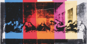
Any Warhol’s The Last Supper
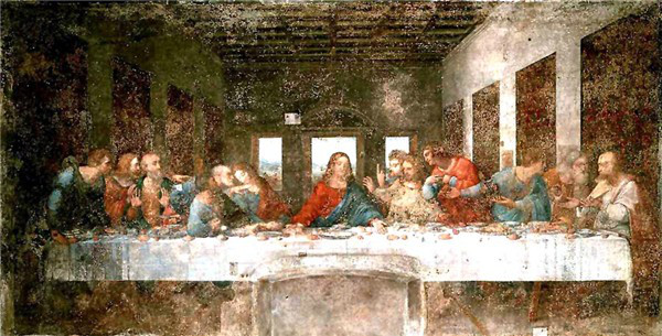
Leonardo Da Vinci’s The Last Supper
Apple’s iOS multi-tasking interface is copied from Palm’s webOS (source)
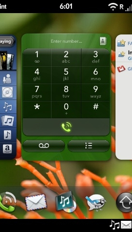
Palm WebOS (2009)
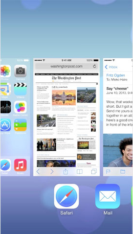
Apple iOS (2013)
What’s the purpose of stealing?
By emulating things we see, we’ll become more comfortable with the specific ideas that constitute a good design, and as we learn more, we’ll be able to put our own twist on those ideas and come up with something original. Emulation alone isn’t enough, the key to learning and ultimately becoming better, is to also think critically about what you’re copying. Try to understand why the original designer made the choices that he/she made. It might take a while, but you’ll start to notice patterns in good design. Try to pay attention to things like spacing/white space, typography, colors, and visual hierarchy
Anatomy of a stolen design: Here’s a practical example.
I recently needed to re-do my portfolio site. The previous version of the site was several years old, it hadn’t been updated in a while, and it felt like it was reflecting poorly on my brand. I’m in the middle of a couple of projects, so I didn’t want to spend too much time on it, and knew that my best option was start with a few sites to draw inspiration from.
Gathering my sources
I’ve been really into minimalist designs lately, and I keep an evernote folder of sites that inspire me, so the first step was going through that folder and finding sites that had a similar look and purpose as my vision for my new portfolio site. Here are the sites that I chose to use as inspiration:
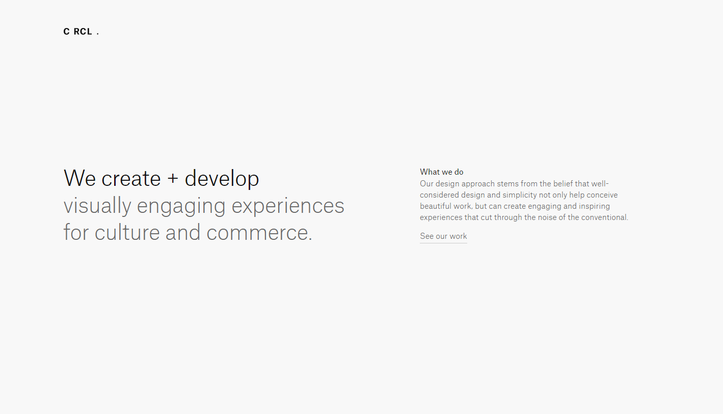
Source #1: CRCL
This is an extremely minimalist site, with a beautiful sans-serif font that I love. I’m a person that likes to get straight to the point, and this site does that exactly that. The first thing you see is a statement that describes their value, with no visual distractions.
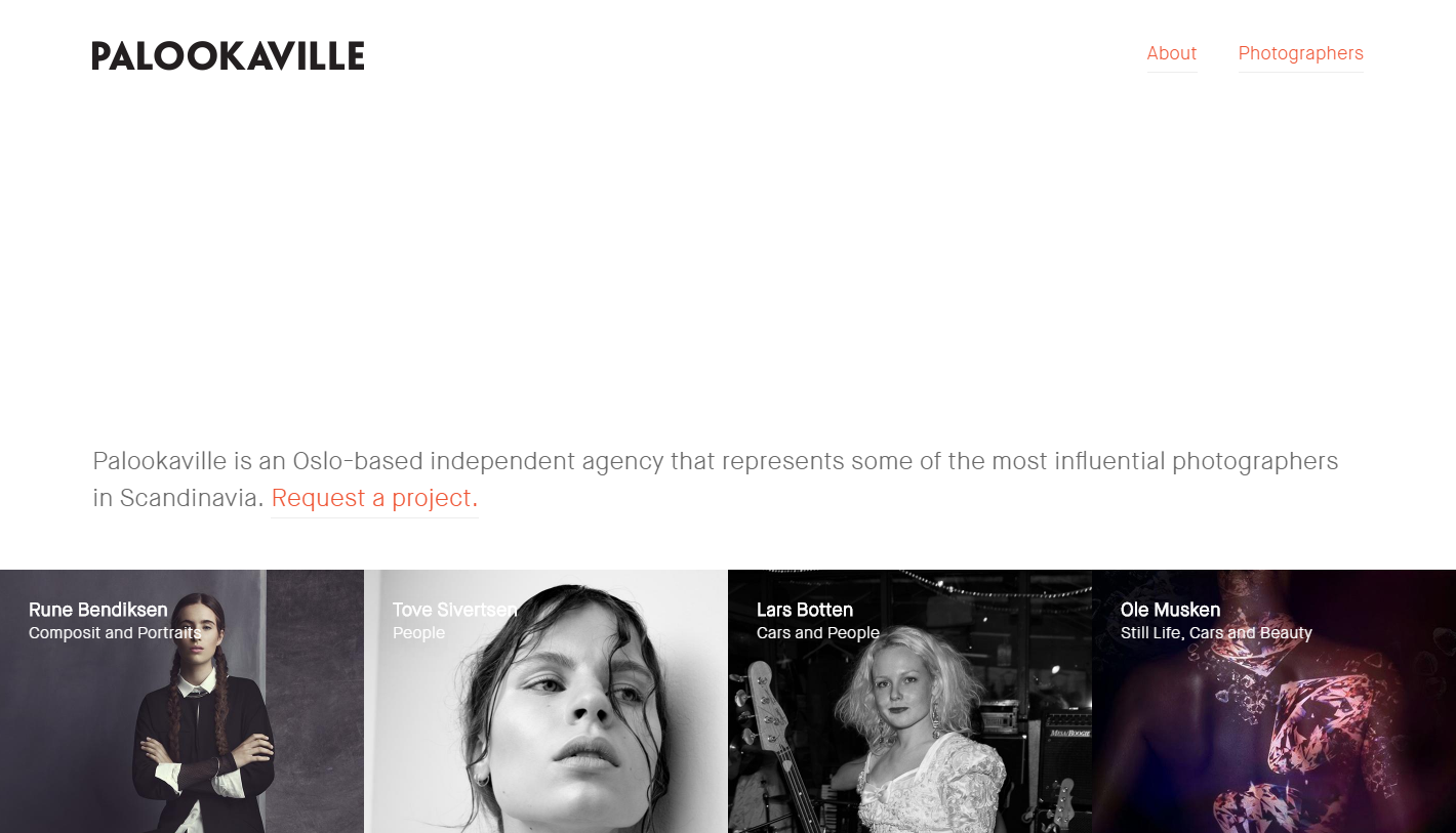
Source #2: Palookaville
This is by far my favorite site on the list. I’ve always loved text based sites on a white background with vivid imagery. It looks extremely simple, but in reality its very difficult to pull this look off and have the site actually look good. Full screen hero areas are the current trend, but I love that the portfolio items ‘peek’ up from the bottom. I also love the accent color in their value statement.
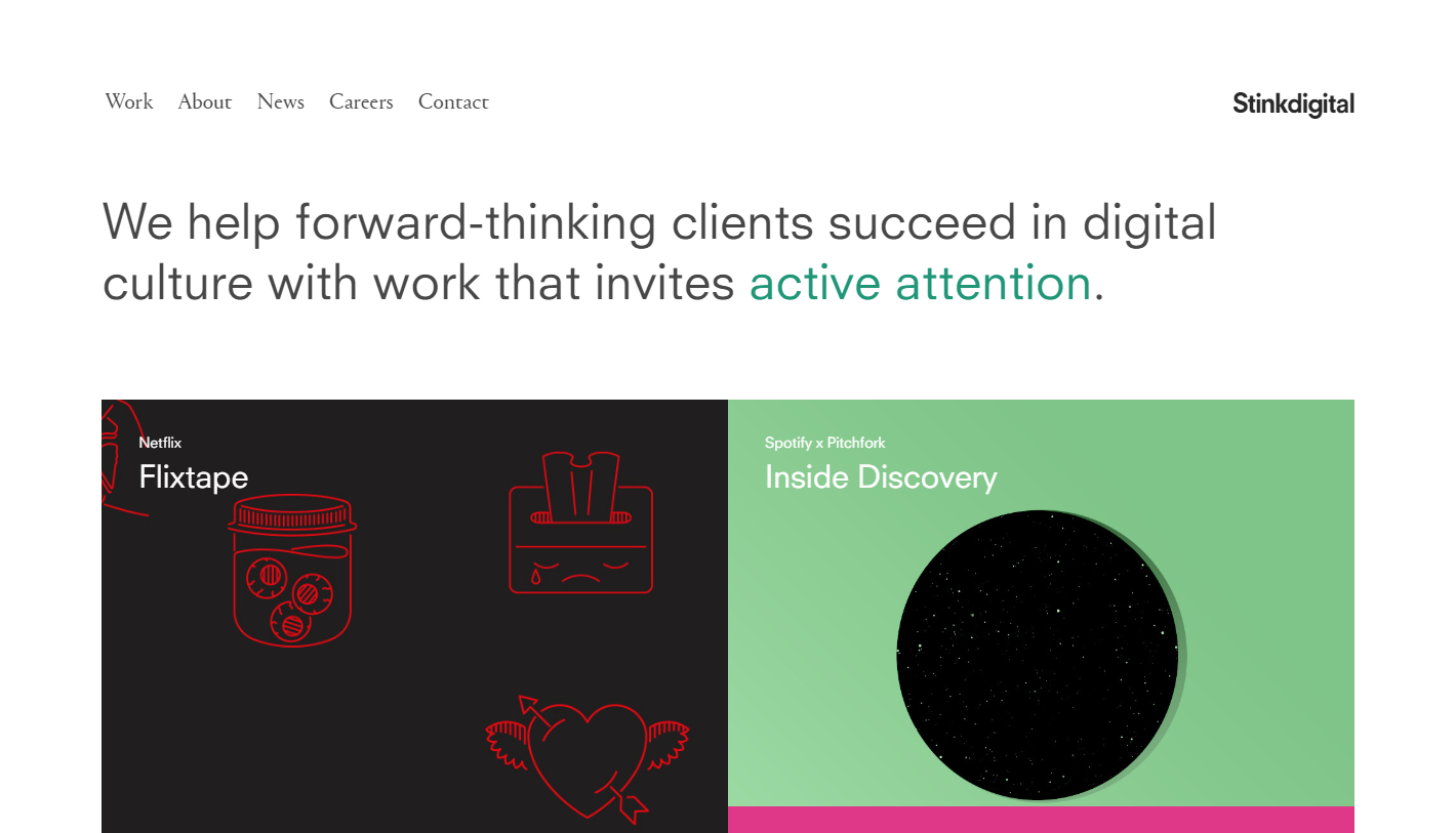
Source #3: Stink Digital
Just like the previous site, this one opens with a value statement. I really like the use of color in this statement to draw in the user’s attention to specific words. I also like the way the portfolio is laid out, but I don’t know if I’ll have the time to create graphics like this for each of my portfolio items.
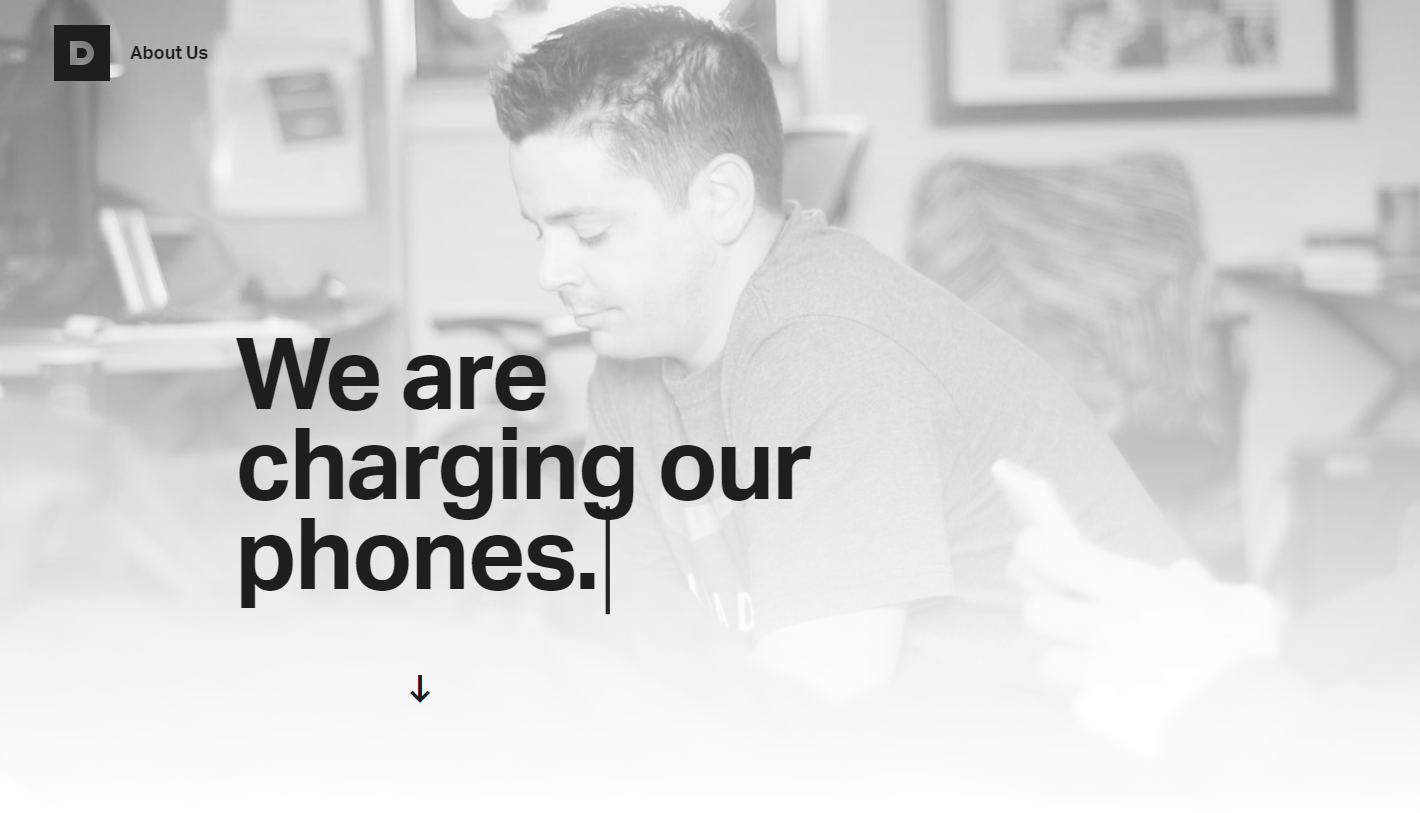
Source #4: Durkan Group
I’ve always loved sites that use this ‘typing’ animation effect. And it seems like a good way to say several things, without taking up a bunch of space on the page. You just cycle through all of the things you want to say. I’ve used this effect before.
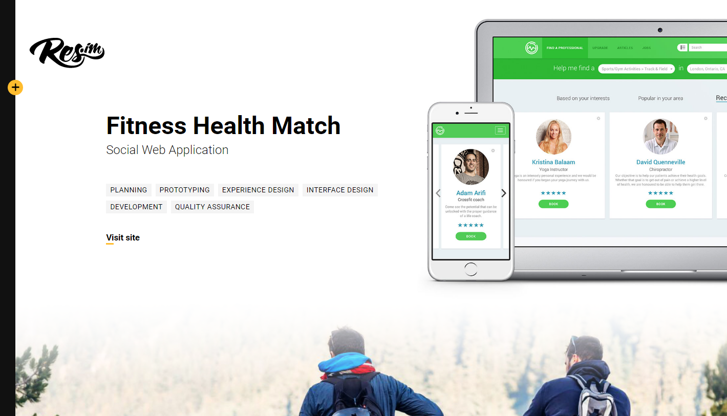
Source #5: Res.im
This is a case study. I’ts well designed, but the thing that stands out most to me is the ‘tagging system’ used to indicated their role in the work.
Deciding what to build
Now that I have all my sources, I have a great understanding of the direction that I want to go with my portfolio.
- It will have a text based intro with a specific words or phrases highlighted to draw the user’s attention
- It will have big portfolio images
- The design will be minimal
- And it will be broken down into case studies.
Build it!
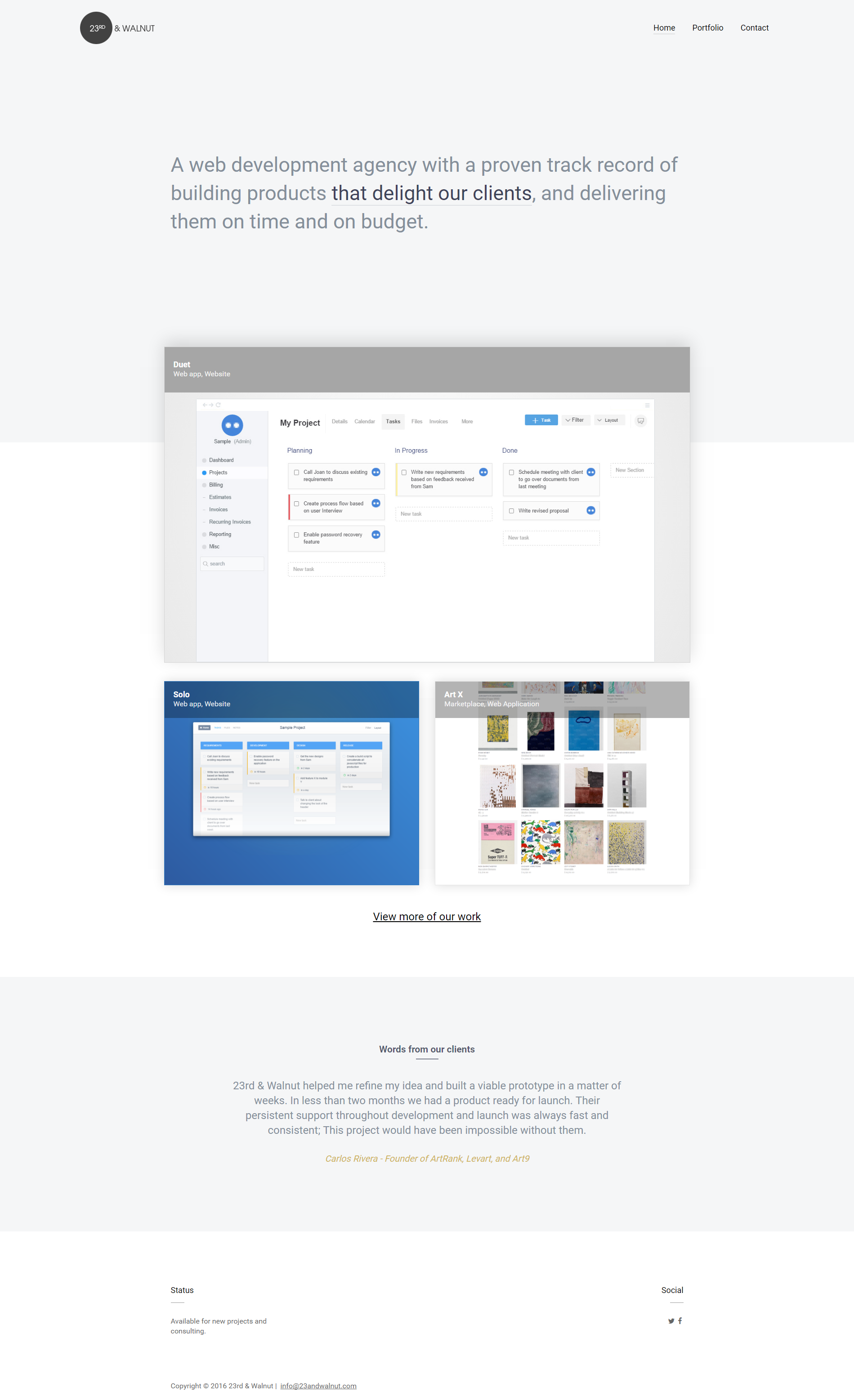
The next step is to build the actual site, using your sources of inspiration where appropriate. It was pretty quick to put together because my sources gave me a solid starting point and clear direction. Here’s what the final site looked like. Below I describe the sources for the main elements of each page.
Home Page
Hero
Just like CRCL and Palookaville, a text based value statement is the only thing in my hero area. And just like those two sites, I used a different color to draw the user’s attention to specific words
Since I loved how Palookaville’s portfolio items ‘peeked’ above the fold, I made sure to include a similar element in my design.
Portfolio Images
Almost everyone of the sites that I used for inspiration used extremely large images on their portfolio pages. I did the same thing.
Typography is extremely important, especially on minimal sites. Ideally I wanted to use a free font similar to ‘Atlas Grotesk’, which is what is used on the CRCL site. According to typewolf, Aktiv Grotest and Nimbus Sans are two good alternatives, both of which are available in Typkit. Unfortunately neither felt right so I ended up using Roboto, which is a font I’ve used many times before with good results.
Portfolio Pages
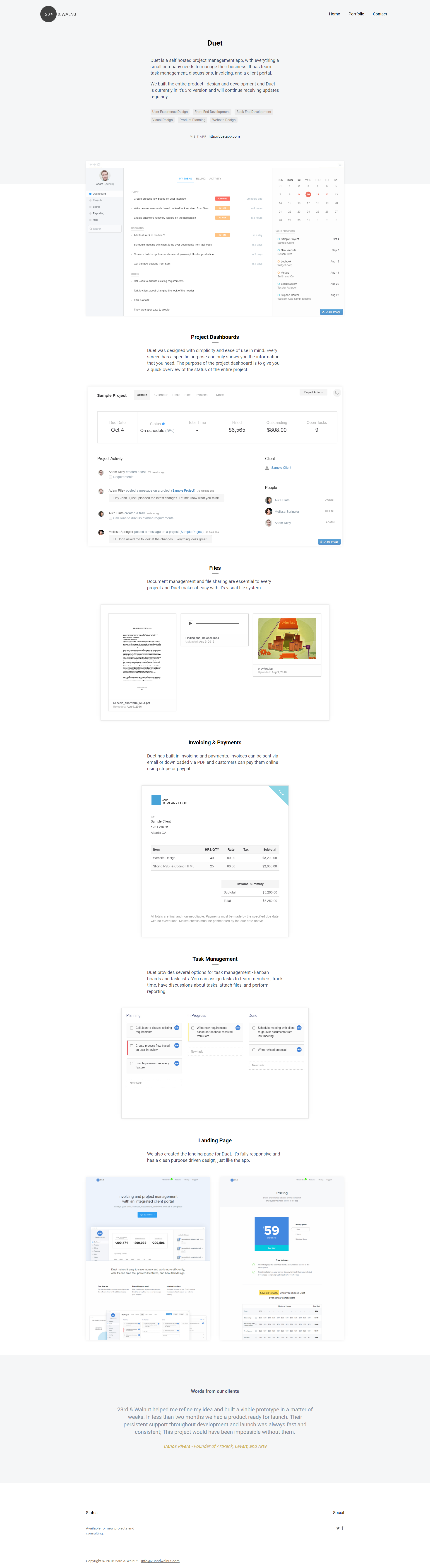
I continued with the theme of having portfolio items ‘peek’ above the fold on all of the portfolio pages, and I used very large screenshots for the portfolio pages, just like almost every site in this list.Tags
The tagging system used on Res.im is a great way to describe your role on a project and it is a great fit for my portfolio.Colors
I really wanted to use white with red accents as the primary colors of the site (just like Palookaville), but this is harder to pull off than it seems. I spent at least an hour trying to make this work, but I was unable to. Ultimately I settle for a light grey.
Key Takeaways
- You don’t need to copy an entire design to use it a source of inspiration. The amount you copy is going to be entirely dependent on your skill level. So when you’re first starting out, you will probably copy more, and there’s nothing wrong with that. Most people started this way. You’ll find your own voice and style as you learn more.
- Keep bookmarks of your favorite sites. Add tags for organization. It makes it much easier to find sources of inspiration when you need them. I spent about 5 minutes finding my sources for my new portfolio because they were already bookmarked
- If you have several sources of inspiration, it makes it easier to ‘hide your sources’ as Einstein suggests. Also, since every product/service/site is different, it’s unlikely that a single existing site would be enough to cover all of the unique elements of your vision.
- It should be obvious, but even though this entire article is about ‘stealing’ you don’t want rip off someones else design. The goal is to be inspired by it, to learn from it, and make it your own based your own unique style and/or goal.